White labeled B2B employee benefits platform
Guardian came to us to conceptualize and prototype a “benefits shopping platform” that would allow employees to browse and select benefits that businesses made available to them. The challenge was to make the experience of exploring a dynamic range of offers as easy and fun as possible.
Requirements
- White labeled interface to allow companies to easily apply basic branding / theme
- Support for a variety of perks from various categories and with varying descriptions
- Simple, clear UX flow to encourage exploration and simplify comparison of benefits
- Web-based mobile and desktop experiences
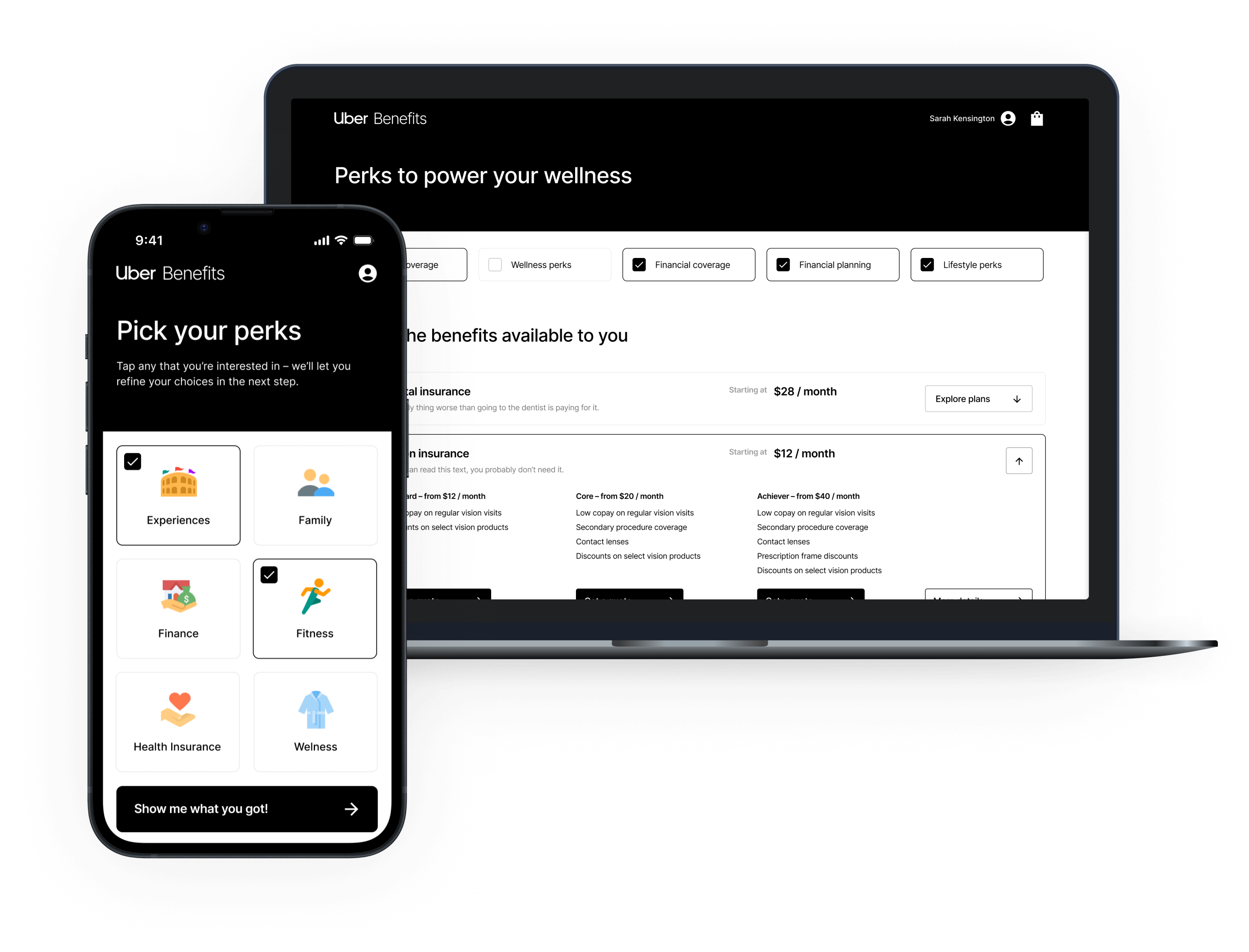
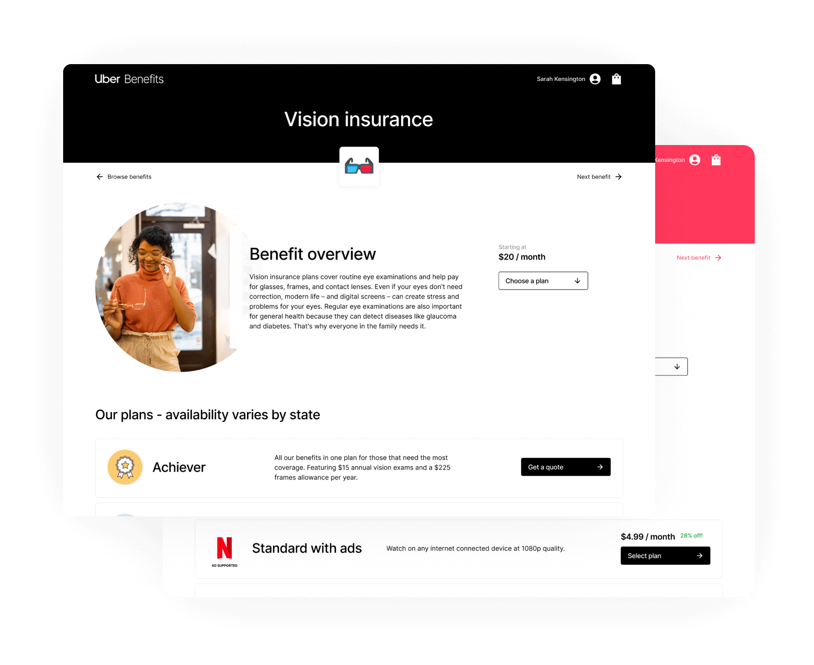
Product concept exploration
Creating a simple, distraction-free experience was essential to ensuring users would explore their options and select the benefits that interested them most. We experimented with several distinct interface patterns that would let users browse effortlessly, whether they were at their desk or on the couch after work.
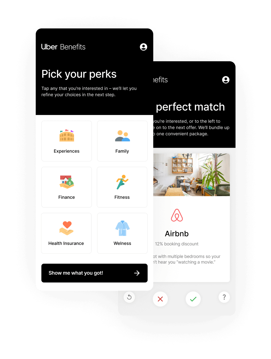
Thematic layout concepts for flexible, dynamic content
The benefits offered by each organization vary widely, and the offerings themselves have a variety of content and configurable options. We designed “wireframe templates” that could be populated with dynamic content, while retaining a singular look, feel, and experience.
We also provided white-labeling explorations, allowing employers to brand their perk platform for their workers.
Services
- Product concept exploration & analysis
- UX research & wireframing
- UI system design
- Interactive prototyping
Deliverables
- UX storyboards for mobile & desktop interface concepts
- Componentized Figma files for ongoing experimentation & iteration
- Interactive prototypes for concept demonstration, user testing, & validation
The bottom line
We collaborated with Guardian to explore concepts for surfacing their products via an innovative B2B employee perk platform, and gave them the framework for validating its usefulness for employers and workers alike.